This is the third part in the Design Language System. In this series we analyze how companies like Atlassian, Polaris and many other companies maintain their design language system. Learn more.
In the first two parts of the #DLS series, we saw how to build a design language system and the benefits it brings along to the brand, users, and the business. In this part let’s see an example of a Design Language System, but before we jump into that, below is a comprehensive DLS checklist from Part 1 #DLS :
[ ] Addressed to the entire digital ecosystem
[ ] Tools for everyone in the digital ecosystem
[ ] Naming Conventions
[ ] Folder System
[ ] Documentation
[ ] Style Guide with a UI Audit
[ ] Pattern Library
[ ] Tool Box
[ ] Grid System
[ ] Typography & Text styles
Benefits of a Design Language System as discussed in Part 2 #DLS :
[ ] Recognizability
[ ] Consistency
[ ] Authenticity
[ ] Ease of use
[ ] Cost effective
[ ] Improves efficiency
[ ] Stability and Flexibility
[ ] Innovation
Let us now review the Atlassian’s Design System.
Atlassian’s Design System
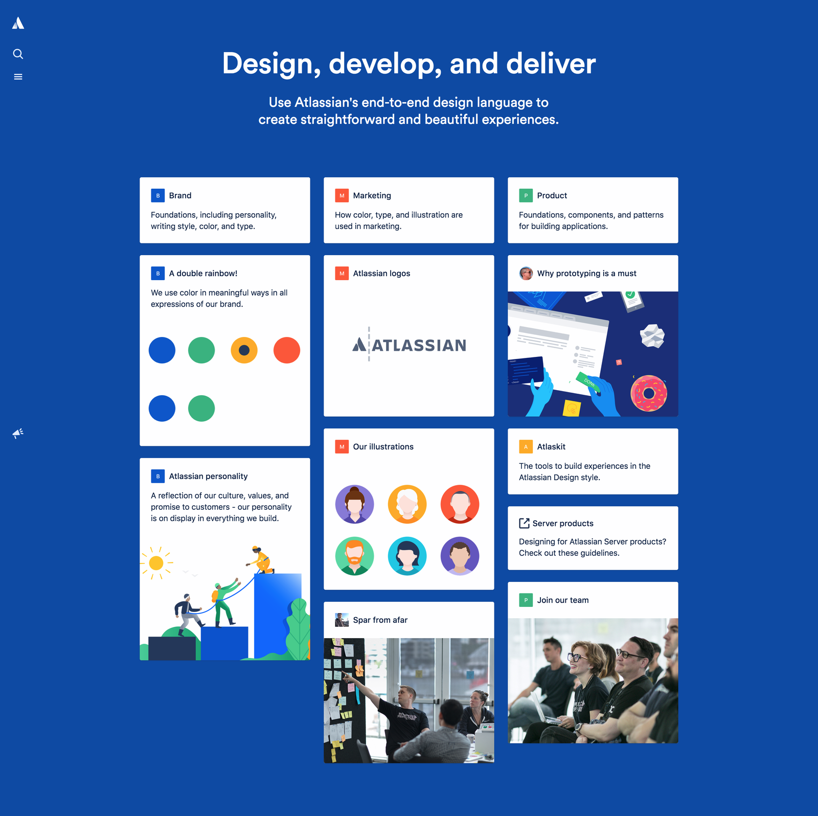
From its very landing page, the system is addressed to every interdependent group in the digital ecosystem. A section for the brand, for marketing and the products itself, apart from guidelines for other aspects like the logos, colours, illustrations etc.

- The level of documentation that Atlassian’s design system provides with a very efficient holistic thinking covering all the interdependent groups shows inclusivity and throws light on their own culture.
- They provide a web UI kit that is available for download. Attention to detail is commendable.
- They have a set of patterns documented and frequently keep updating this list. They make sure this is communicated to the users in a section called What’s new? Staying pro-active in iterating the system adds value by staying relevant.
- At Atlassian, they follow a grid system to produce visually harmonious and coherent screens. The grid system is thoroughly documented and available for the public to see.
- The typography for different OS with the font stacks and its usage is documented and also available for download as a Web UI Kit.
- The section about brand highlights the benefits that the system brings to its products.
- The section for the brand addresses the personality that Atlassian’s products should reflect and the writing style the texts should follow. This personality gives its products recognizability and authenticity.
Other examples of design language systems are :
- Polaris - Shopify’s Design System
- IBM’s Design System
- Airbnb’s Design Language System
- Fluent - Microsoft’s Design Language System
- Nachos - Trello’s Design Language System
- Lightning Design System - Salesforce
- Apple’s Design Language System
Every day, a new Design Language System is built to make brands and businesses better and more efficient. Watch this space to learn about how our design team built Skcript’s very own Design Language System.
Up next
Five ways blockchain is transforming your industry Skcript
/svr/a-design-language-system-example-part-3-dls/
/svrmedia/heroes/f/design-language-system-example.jpg
