
This blog is about how to improve from good to great UI/UX Design in 10 easy steps. Beginners bookmark this page, it can help you if you are struggling to improve. I don’t wanna brag about how useful these tips are, I found them helpful so thought of sharing it with you guys. To apply these tips, make sure you read the whole blog.
A functional and usable design is good but wondering what makes your design enjoyable and worth sharing? Okay! So am gonna teach you how to achieve it using 10 quick steps. If you already knew this, pass it on to your beginner buddies.
To make it easy for you (and me :P) I have reduced the content and have added more images so that you can take a quick look at this blog anytime you want. As I said, it’s a design checklist. So here we go!
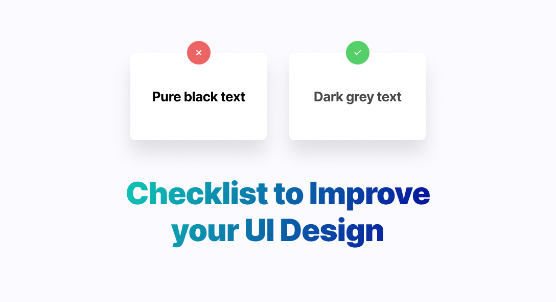
1️⃣ Say no to full black
Black is not a bad idea but darker grey in texts will make your design look more professional and improves your interface.

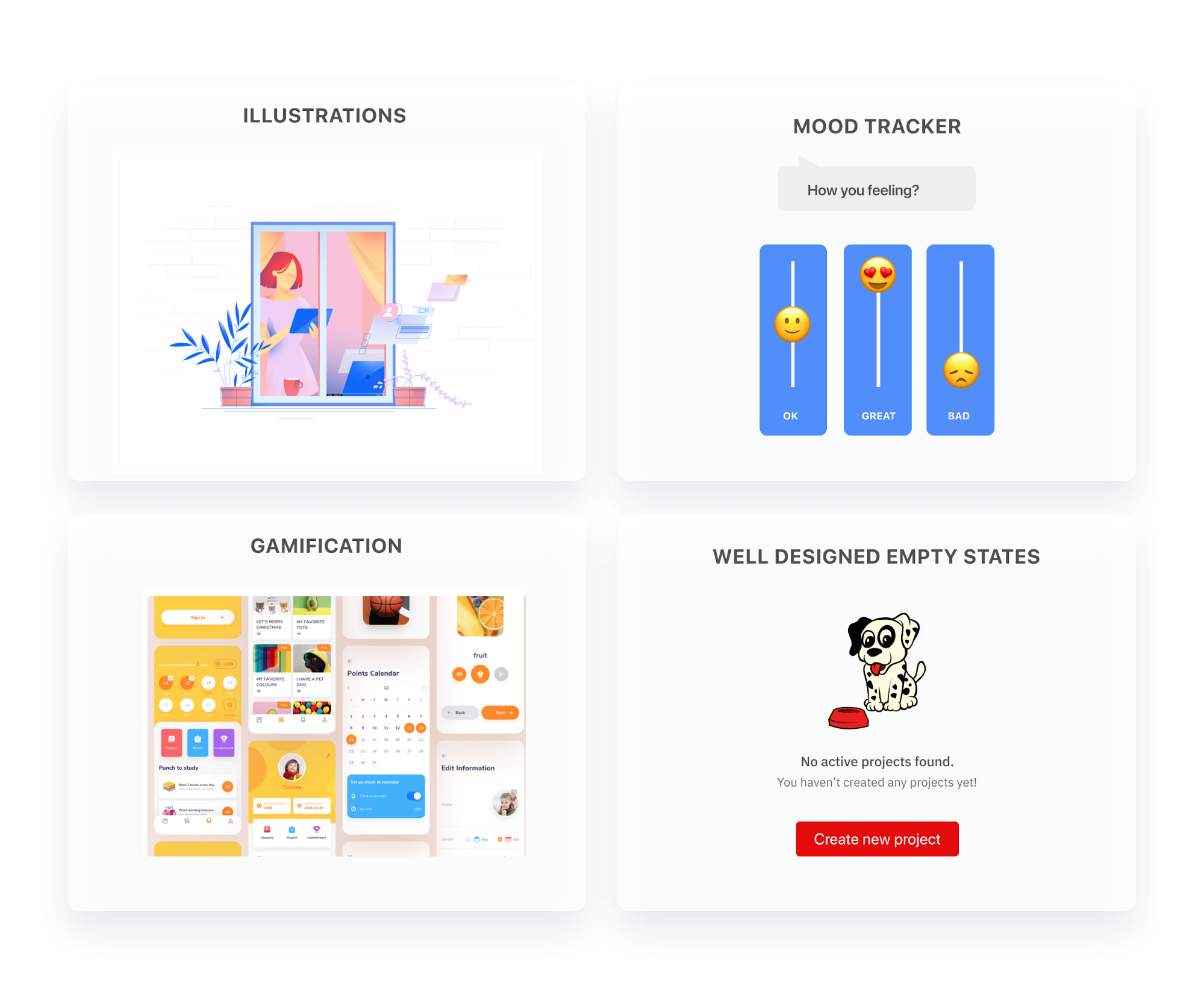
2️⃣ Make your design more human
The best way to grab the attention of your users is to make them feel connected with your designs. Illustrations, reactions, well designed empty states, and gamification are great ways to spark the emotions of your users.
When your users connect to your design on an emotional level, your product is a joy to use. And, when you design products that make your users happy and not piss them off, your products become worth sharing.
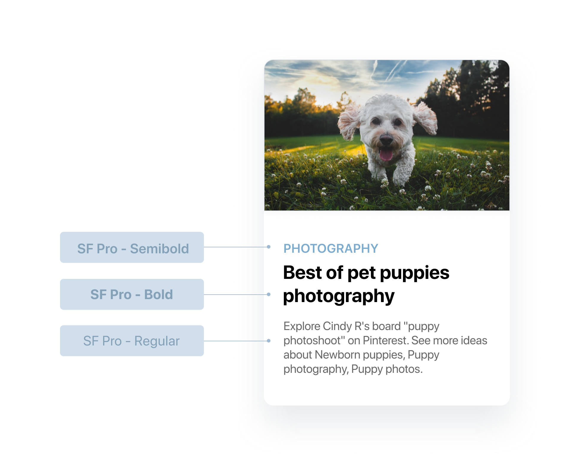
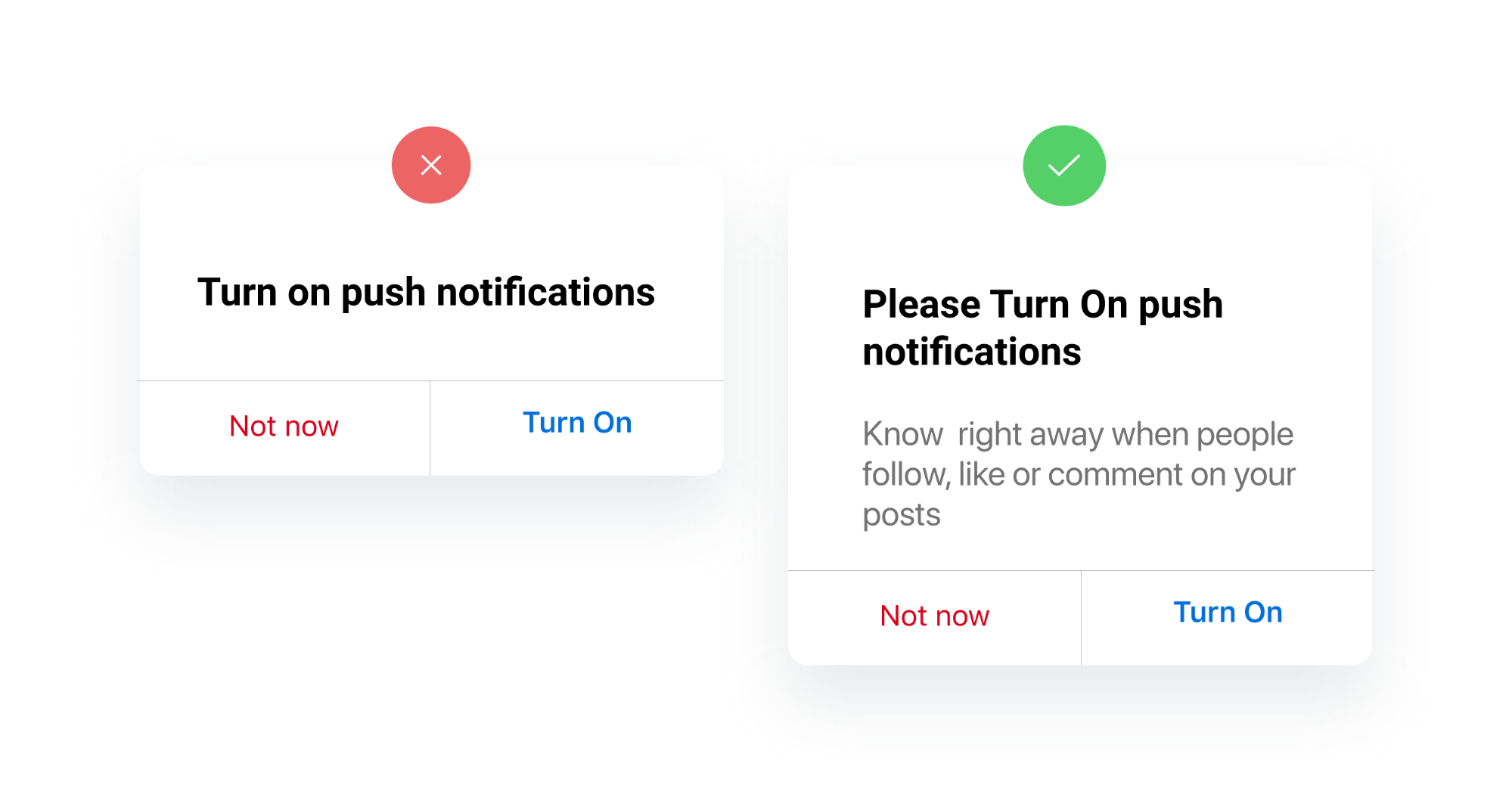
3️⃣ Focus more on your typography to make your design impactful
Typography a potent tool of a design that helps in creating the message you want to convey to your viewers or the target audience. Keep these 5 things in mind when it comes to typography.
1. One or two typefaces is all you need
Don’t use more than two typefaces. Using a combination of weights, sizes, and colors of one font can do it great.
2. Don’t leave the line-height to its auto value
A 10% increase in the auto line-height value will make the text readability level higher.

3. Uppercase text needs letter spacing
When the whole text consists of uppercase letters can be difficult to read without letter spacing.

4. Text and Headings hierarchy
Hierarchy guides the viewer’s eyes. Highlight the important parts of the text like headings, links, and buttons bold. Don’t have more than 4 font sizes.
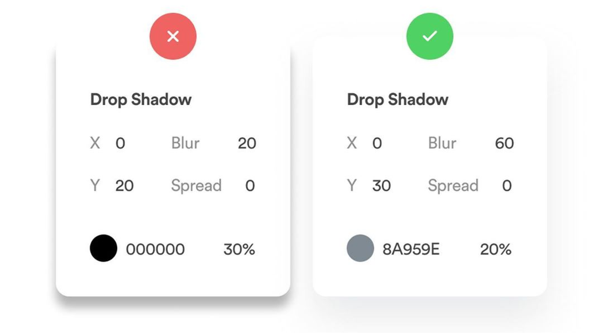
4️⃣ Soft shadows
Again, don’t use full black. Go for a darker color instead, the darker shade of the surface on which it is cast.
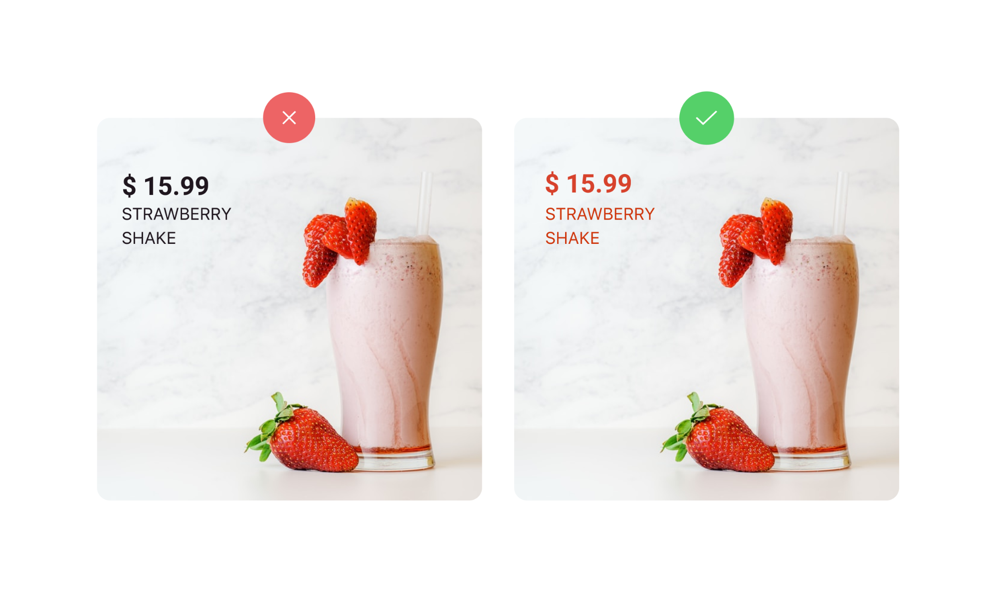
5️⃣ Pick colors from your images
Applying tints and shades to your background, text, icons, or more can add character to your designs. And make sure they are in contrast to each other.
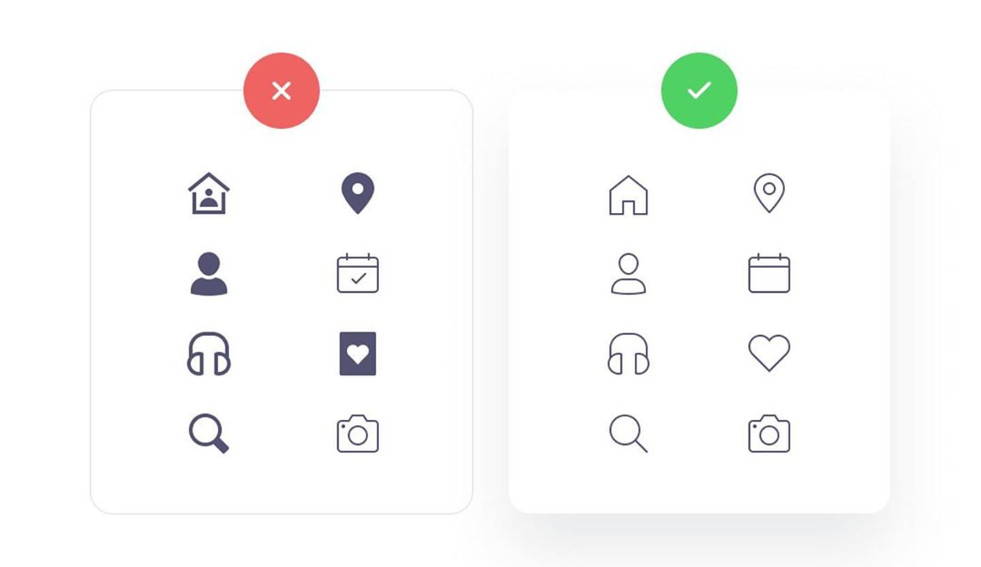
6️⃣ Keep icons and buttons style consistent
Consistency is the key to great design. Make sure you carry the same style of design with icons and buttons.
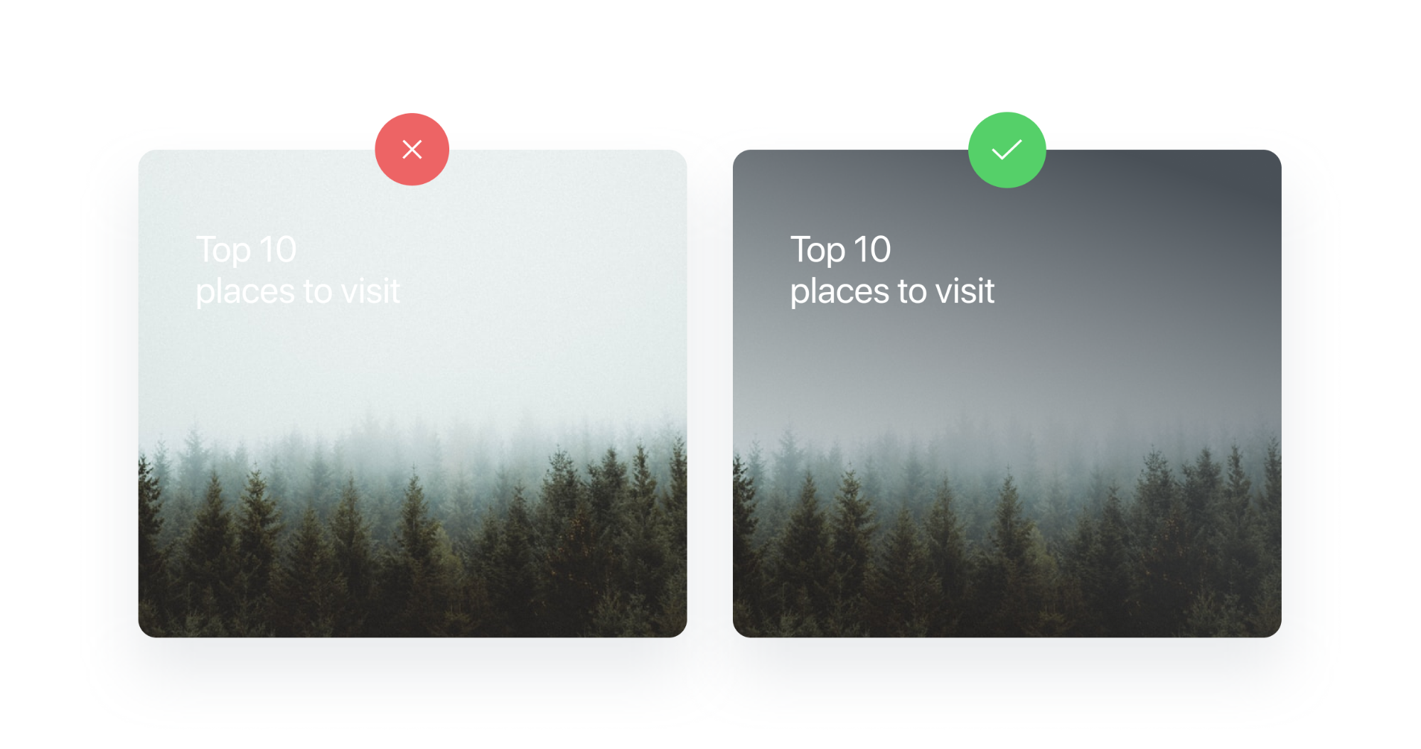
7️⃣ Improve contrast with overlays
Ensure that the text you use in your design is readable on any type of monitor. You can use a subtle gradient overlay to make the text contrast over a background image. Similarly, for text in the placeholders and buttons.
8️⃣ Margins, spacing, and layouts
Negative space or the white space is a crucial element of the design that ensures the right amount of space between the different elements in the design. Avoid extra frame lines or margins. Maintain equal spacing between the margins.

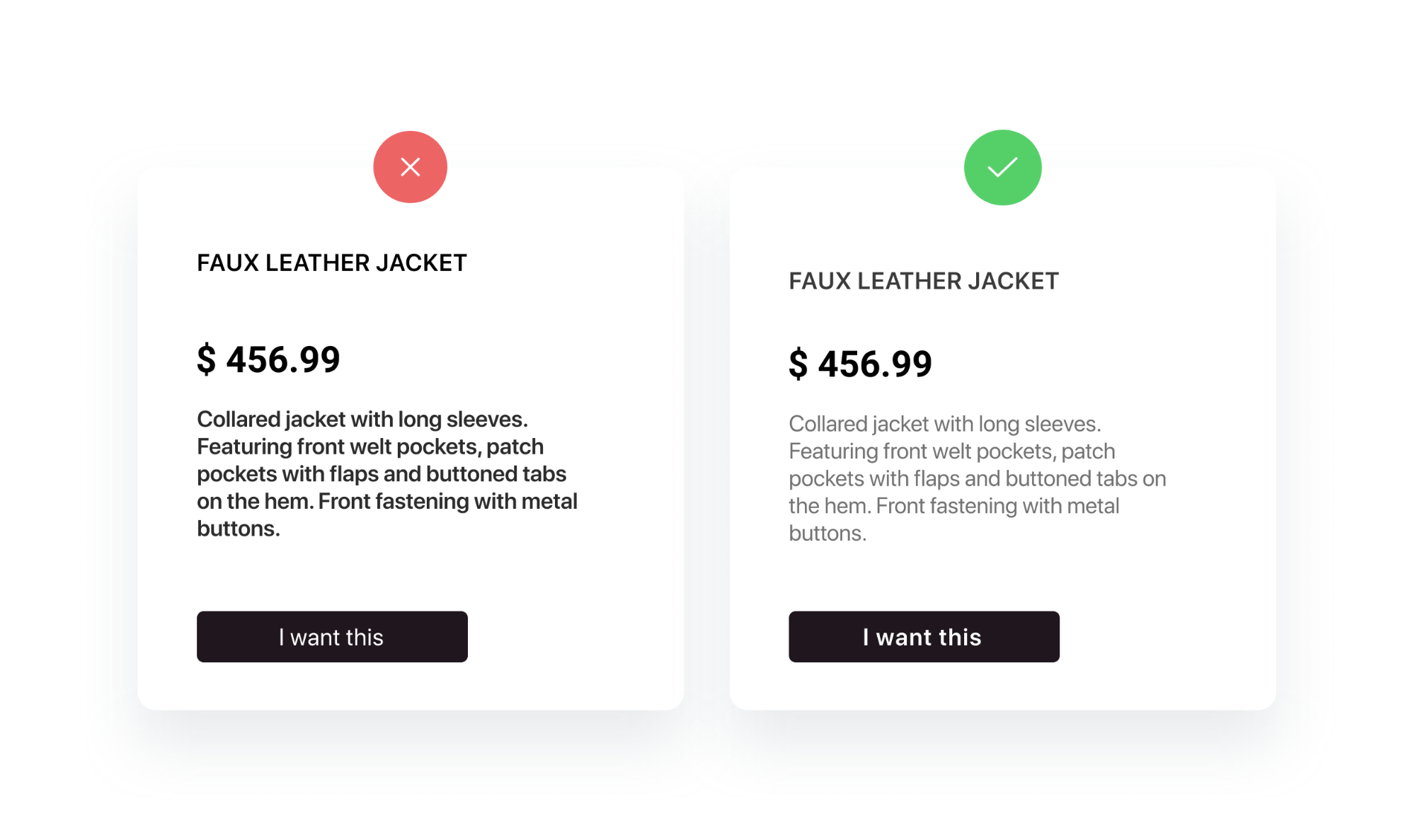
9️⃣ Descriptive options
It is always better to have descriptive options for important warnings. It gives the users clear information and aids in taking quick and accurate actions.

- Never blame the user
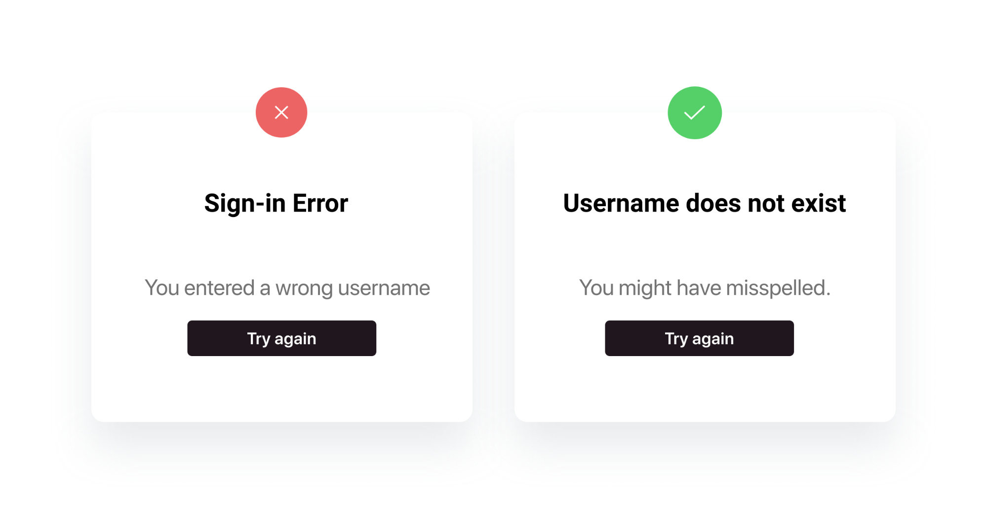
- Tell the why for the action
- No harm in little humor

🔟 No more lorem ipsum
Avoid using the sample text lorem ipsum in your design even if it’s for demo purposes. Instead, use some decent and relatable content which will make your design look even more professional. Don’t worry about the content, there are a bunch of Figma and Sketch plugins that have got you covered. Use high-quality pictures, different headings, and preview texts of different lengths.
Yep, that’s it for now. Thanks for reading. Hope you have learned something cool! :)

Up next
Process Documents Using Artificial Intelligence For RPA Bots