
Is the title making you curious? Well, it should! While we’re designing for ourselves, how often have we thought about designing for others? Just like design is universal, users are too. Here’s how we can design and touch base with every type of user.
Have you ever walked into a room to pick up something only to wonder why you ever got in there in the first place? Or, what about the time you picked up your phone to do something only to be lost on why you picked it up at all?
Let’s admit it. We all have been in many such similar situations. With so many things going on in our mind, it’s extremely easy for us to get distracted where we might just wander off into the wardrobe from the Chronicles of Narnia (that is, if you’re lucky and able to find it)
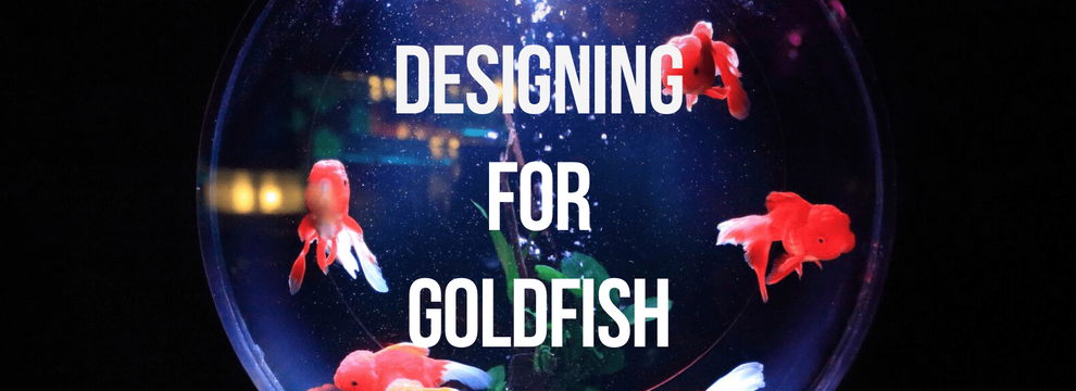
Now, imagine a gold fish and yourself. There’s a lot of difference between you two, isn’t it? Goldfish can breath under water, you cannot (without a scuba tank) - it doesn’t have to worry about paying taxes or the EMI of the Apple Watch that you bought for no reason. It has scales, you don’t. It has a tiny brain whereas you have a big one. It has an attention span of 9 seconds, you have about 8.
8.25 seconds to be exact. That’s how long you can focus on something continuously. You know why? Apart from a million things going on in our heads, we have a small device in our pocket that keeps beeping everytime someone gives you a ❤️ on Instagram. Whereas in 2000, the attention span was about 12 seconds according to a research conducted by Microsoft.
Why are we turning into Goldfish?
Well, not literally but, you get the point. Our attention span has been drastically decreasing since the advent of smart phones. Think about the times when you didn’t have a smartphone with you. If you wanted to check your email, you had to log into a PC (or, Mac if you were rich). SMS was kind of expensive so there was no need to check your phone every 5 minutes to see if your crush replied to your Good Morning message. No annoying Whatsapp family groups to remind you that it’s morning after the sun comes up. And, there are a lot more instances from your life that you can think of.
If you think about it deeply, smartphones are not exactly the culprits for our reduced attention span. It’s the notifications from the various apps that we have on our phones. For instance, imagine you’re waiting eagerly for the OTP to complete a transaction. At that very moment, your friend sends you a WhatsApp forward with a very interesting story that made you open the message to see what it’s all about. That WhatsApp message served as a distraction to your attention span which eventually made you quit your primary intention of completing the transaction.
“We become what we repeatedly do.”
Whenever you pick up your phone, you’re bombarded with a dozen notifications from various apps that crave your attention. Now, what happens when you keep clicking on any notification that your phone throws out? You form a habit. An attention draining habit.
Unfortunately, that’s what your smartphone, that you sometimes take into the restroom, has induced in your brain. A lack of attention as we’re always on the lookout for something else other than what we see on our screen.
Designing for the Goldfish User
There is no one size fits all when it comes to designing UI. The points mentioned below would be most suitable for Product Landing Pages, Facebook/Instagram ads, Marketplace listing, Medium articles or just about any platform where everyone else if fighting for the users’ attention.
Strike the right chord with the users
Let’s say you’re designing a landing page for one of your digital products. There are high chances that there would be someone else targeting the same market as you. In such a situation, how can you make sure that the user would at least click the sign up button?
Explain in a concise and visual way how your product can solve the problems they’re facing. Making a list of features with pretty illustration would grab their attention but it does a bad job in making the user understand the value your product adds. Getflow does an amazing job at this.
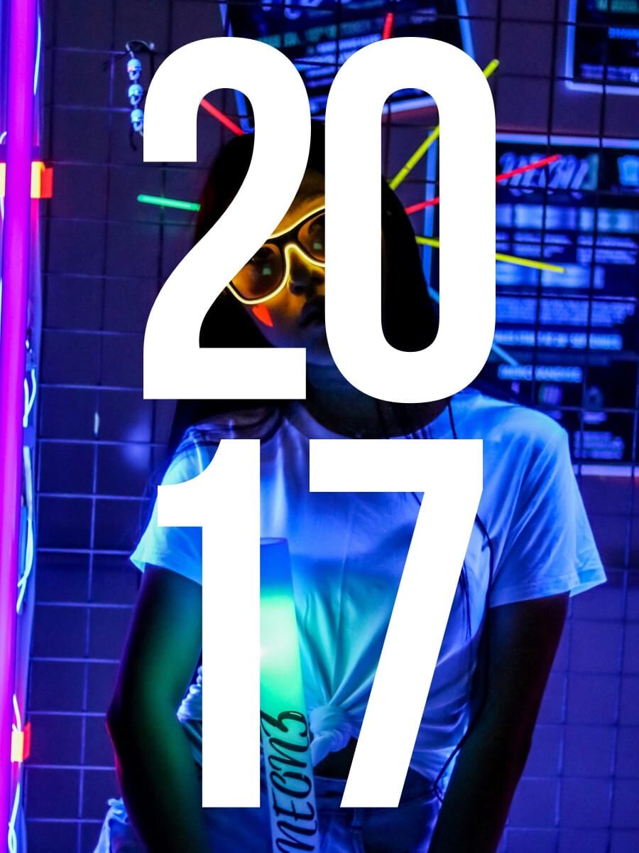
Use strong visuals
There is nothing more visually attractive and attention grabbing than a high contrast yet visually appealing color palette. Ever wondered why successful marketing campaigns use neon sign boards to market whatever they’re trying to sell? Because it’s bright when it’s dark and there’s no way you’ll miss it.
Users crave Novelty
With the flood of a ton of information to the average user, they get bored of seeing things which are similar to each other, again and again. Users want to see the same things done in a different way so that they don’t get bored, which will make them pay attention.
On October 3rd 2017, Dropbox announced the biggest change to their brand in their 10 year history. Their rebrand had mixed reactions from the ‘design community, but it sure did create a buzz when it came out.
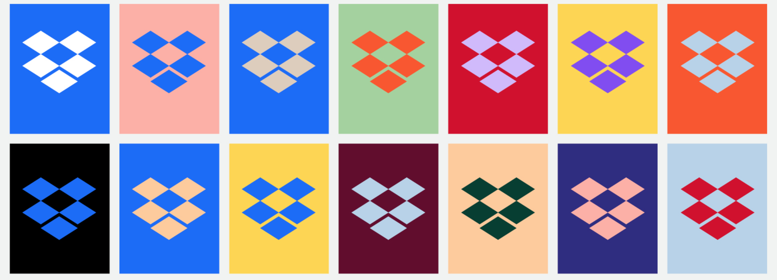
I mean, look at those colors. They just don’t look good together in my opinion but no one expected that from Dropbox. And, that is what made us pay attention to their rebrand. Unconventional and totally out of the box.
Invoke Users’ Emotions
If there’s one thing that will gain the users’ attention, it is directly connecting with any kind of human emotion. There’s a reason why #love was the most used hashtag of Instagram in 2017. Going by the statistics, posts with #love on Instagram got more ❤️ as users could connect to love as an emotion easily.

This is an actual photo of a Burger King branch in Oregon, United States on July 9th 2016. The ad agency, David Miami, that produced the “Burning Stores” ad campaign for BK, made use of these photos to strengthen the point that BK burgers are Flame Grilled since 1954.
One reason why this ad campaign was successful is that anybody seeing a burning BK joint would be traumatized by the fire incident. But, BK used it as an opportunity to market their iconic flame grilled burgers.
We’re exploring more user-centric design hacks and soon we’ll be out with those as well, until then feed the Goldfish users with the most suitable design! 😉
Up next
Simple Steps To Run Hyperledger Fabric Composer Network With Multiple Organization