Learn how to make a custom component to satisfy both the design language and make both look similar to a native application with React Native
React Native has all the components and functionality that works perfectly for app development but both Android and iOS works differently in design language. To satisfy both the design language and make both look similar to a native application, custom components play a major role in App development.
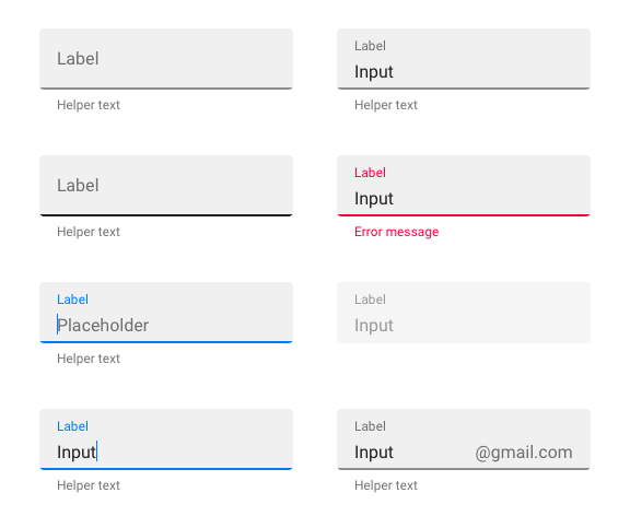
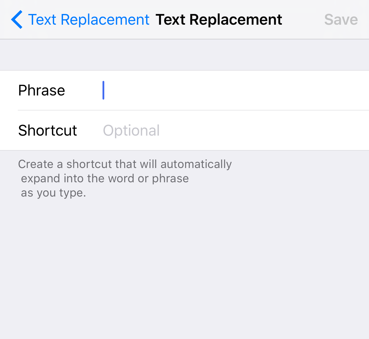
Let’s take Text field as a really good example both Android and iOS since both of them have a different style for Text Field.
Android:

iOS:
 Let’s start by creating a Custom Text Field Component for both Android and iOS which will look similar in their design language.
STEP 1: Create a class for Custom component and define the props which will customize our Custom component.
export default class CustomTextInput extends Component {
   static propTypes = {
    containerStyle: PropTypes.style,
    style: PropTypes.style,
    autoFocus: PropTypes.bool,
    editbale: PropTypes.bool,
    textColor: PropTypes.string,
    onChangeText: PropTypes.func,
    value: PropTypes.string,
    placeholder: PropTypes.string,
  }
}
STEP 2: Then let’s start with the render() method
import React, { Component } from 'react';

import {
  View,
  Platform,
  TextInput
} from 'react-native';

import CustomTextInputStyle from './CustomTextInputStyle';
import { TextField } from 'react-native-material-textfield';

export default class CustomTextInput extends Component {

  render() {
    if(Platform.OS === 'ios') {
      return(
        <View style={[CustomTextInputStyle.mainBlock, this.props.containerStyle]}>
          <View style={CustomTextInputStyle.textboxBlock}>
            <TextInput
              textColor={Colors.brandText}
              style={[CustomTextInputStyle.textInput,this.props.style]}
              labelFontSize={12}
              autoCapitalize={false}
              editable={this.props.editable}
              value={this.props.value}
              onChangeText={this.props.onChangeText}
              placeholder={this.props.placeHolder}
              placeholderTextColor={Colors.placeHolderText}
              autoFocus={this.props.autoFocus} />
          </View>
        </View>
      )
    } else {
      return(
        <View style={[this.props.containerStyle, CustomTextInputStyle.mainBlock]}>
          <TextField
            textColor={Colors.brandText}
            style={[CustomTextInputStyle.textInputAndroid,this.props.style ]}
            labelFontSize={12}
            value={this.props.value}
            editable={this.props.editable}
            activeLineWidth={1}
            autoCapitalize={false}
            labelTextStyle={{fontFamily: 'Roboto-Regular'}}
            tintColor={Colors.brandSecondaryText}
            onChangeText={this.props.onChangeText}
            renderAccessory={this.renderIcon.bind(this)}
            label={this.props.placeHolder}
            placeholderTextColor={Colors.placeHolderText}
            autoFocus={this.props.autoFocus} />
        </View>
      )
    }
  }
}
Here the Platform object separates the code for iOS and Android but the Components are controlled by various props. With a native component, we cannot achieve Android’s material Text Field which can be solved by installing and importing “react-native-material-textfield” for android.
STEP 3: Import the Custom Text Field Component in parent component and make sure you give right path for the component.
import CustomTextInput from './CommonComponents/CustomTextInput';
STEP 4: Insert the Custom Component inside render() method of parent component where we want the display in.
<CustomTextInput
  textColor=’#111111’
  style={style.textInput}
  containerStyle={style.textInputContainer}
  editable={true}
  value={this.state.username}
  onChangeText={this.setUsername.bind(this)}
  placeHolder="Username"
  autoFocus={true} />
Now you can run this on iOS and Android to see the difference in the text field which is usually difficult to achieve with default react native text field component. You can also create a useful custom component for Button, Text Label, Search bar etc. Make sure you utilize the advantage of reusable code to the full extent in React Native :)
Up next
Configuring Node SDK’s Connection Profile for Multiple Channel - Multiple Chaincode Skcript
/svr/how-to-create-custom-component-in-react-native/
/svrmedia/heroes/f/custom-component-react-native.png
